By Leanne
Spring is the perfect time to give your home that much-needed refresh after the gloomy skies and drizzle that winter brings. A great way to do this is to add happy/joyful colours that bring warmth, energy, and positivity into your space. As the days get longer and nature bursts into life, incorporating colour can be a great way to feel new again.
In this guide, I’ll walk you through the best joyful colours for spring and how to style them in different areas of your home—whether you’re looking for a full-room transformation or simple, easy-to-change accents.
5 Joyful colours and ways to add them to your home
1. Muted grounded yellow
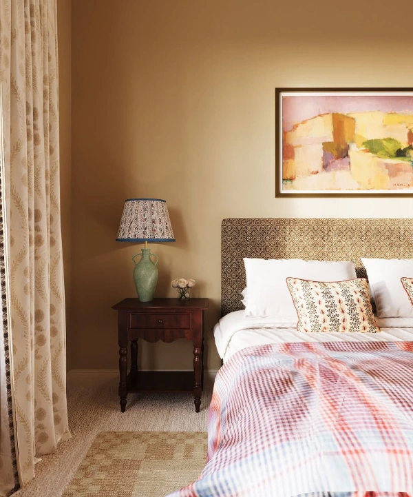
Yellow is a joyful colour as it reminds us of the sun, so it’s only fitting to include this colour in our favourite shades for Spring. This gorgeous bedroom design by Effortless Interior Design is a great example of how to use yellow in a calming way, by using a muted shade that leans towards brown. Then, use warm decors like dark wood, textured fabrics and a pop of red to keep the scheme feeling cozy!
Get a similar look with our moodboard
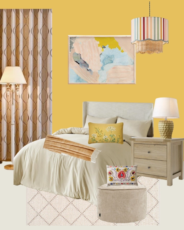
Shop the look:
- Craig & Rose Lamplighter paint
- Cream duvet set
- Brown pattern curtains
- Plush footstool
- Handmade rug geometric pattern
- Pastel abstract wall print
- Bedside table
- Table lamp
- Rainbow shade
- Floral rectangle cushion
- Yellow cushion
- Blanket throw
Or try yellow and green for a boho look!
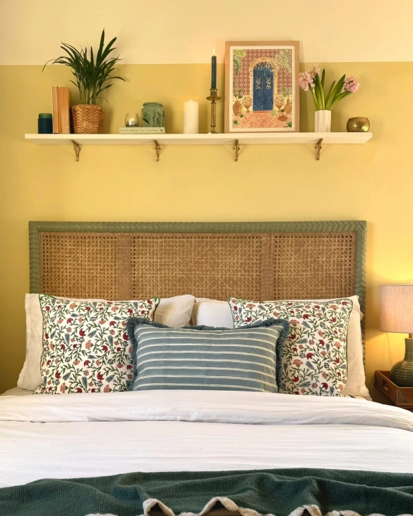
If you love bold colours, you can still use vibrant yellow in your bedroom. Check out this lovely boho bedroom design by Becks above. The two-tone wall and white floating shelf break up the colour scheme. If you’re wondering what colour to use in a yellow room, consider sage green, peach, pink, and red, which will keep the scheme warm and interesting, as you can see in the image above.
Yellow and pink are also a joyful match
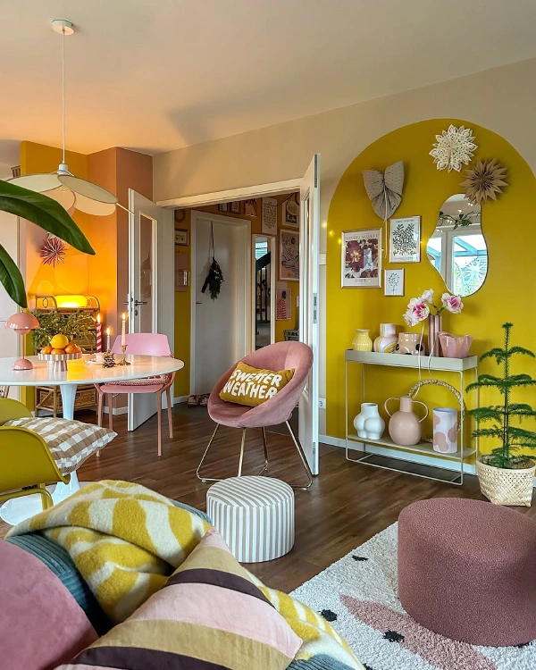
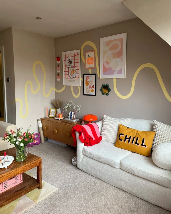
Combine yellow and white on your walls to break up the colour. To add extra joy to your space, use shapes like circles and arches to create visual interest. Dusty pink is a lovely colour to introduce as an accent colour, as you can see in the living room above, which adds a touch of coziness and warmth.
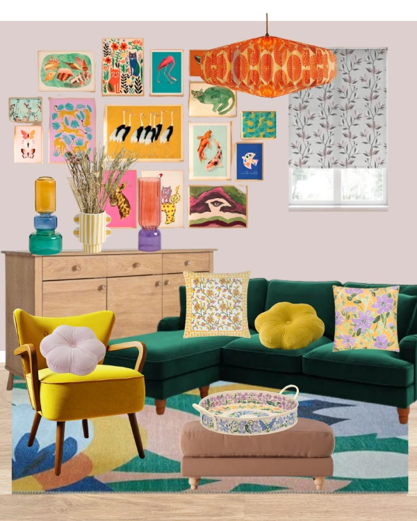
2. Pastel green with a pop of colours
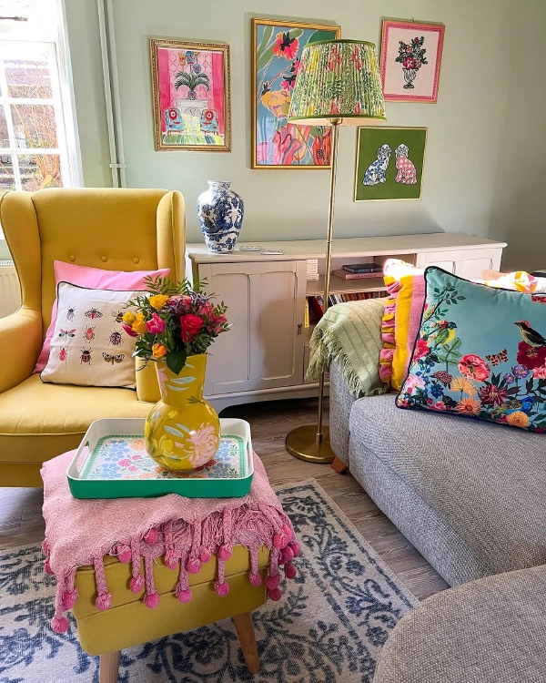
Green is a fantastic colour to use, as it’s balancing and easy on the eye. This is why its also a great colour to use with other joyful colours, like yellow, pink and teal. This lovely living room by Louisa balances eclectic and cozy decor for a fun space full of joy, through the use of pattern and texture with cushions, blankets and vases. All of which creates visual interest and a theme of florals that flow through the space.
Shop a similar look with this moodboard
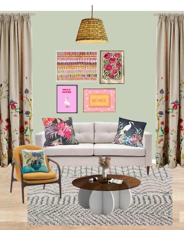
Shop the look:
- Farrow & Ball Palm paint colour
- Neutral sofa
- Blue cushion
- Floral cushion
- Armchair
- Artistic blue cushion
- Blue-grey rug
- Coffee table
- Be Nice artwork
- Colourful abstract artwork
- Silly Goose artwork
- Peonies artwork
- Floral curtains
- Green and pink lamp shade
3. White and pops of colour for an uplifting space
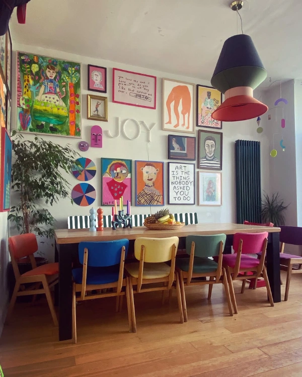
If you can’t decide what joyful colours to use in your space, why not have a mix of them all! We are inspired by this colourful dining room, which has an off-white wall as a canvas for colourful, more saturated decor that brings joy to the space.
For a fresh look, use a crisp, bright white to make your colour decor pop. We love this gallery shelf wall with colourful artwork and cute fairy lights, making it feel homely and fun. To make your gallery wall feel cohesive with the rest of your space, use similar textiles around your room like Nephty has done with the cushion arrangement.
Get a similar look with this moodboard
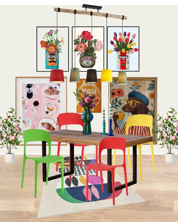
Shop the look:
- Dulux Jasmine White paint
- Colourful dining chairs
- Vase
- Colourful pendant lights
- Cake print
- ‘All You Can Eat’ print
- Fun ‘Tin’ prints
- Dog drinking tea print
- Colourful rug
- Faux blossom tree
4. Pretty and pink
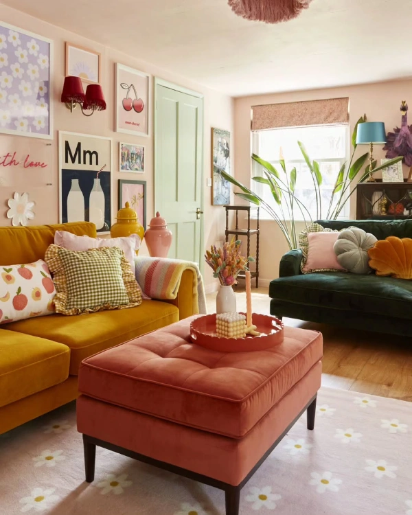
If you’re considering a pastel colour for your space, a light pink could be a good option. Light pink is a warm colour that can be used as an alternative to white. This gorgeous pink living room by Charlotte is a great example of how you can use pink as your main wall colour while still keeping your space feeling fresh and light. We love the introduction of other colours too, through rich velvet fabric sofas in yellow and green, which adds a touch of sophistication to the space.
Get a similar look with this moodboard
Shop the look:
- Dulux Potters Pink paint
- Green sofa
- Floral blinds
- Sideboard
- Yellow armchair
- Pink pouffee
- Floral tray
- Flower shape cushions
- Yellow and pink floral cushion
- Yellow and purple floral cushion
- Floral rug
- Yellow and green vase
- Yellow striped vase
- Red and purple vase
- Gallery artwork
- Orange lamp shade
Combine pink with panelling
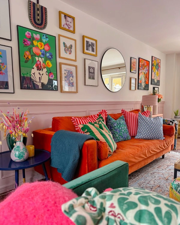
Another great way to style pink in your living room or space, is to combine it with panelling. This helps break up your space and creates a divide for your furniture, creating a horizon/focal point in your room. Panelling part of your wall is also a great way to break up colour if you don’t want all of your wall pink or one colour. We love the pops of orange in this scheme, which adds warmth and a touch of femininity.
5. Beige grey with pops of colour
If beige and grey are more your vibe and you’re a neutral person, this idea is for you! Keep your neutral scheme but add pops of colour to create joy through decor and furnishings, like Natalie has done in this living room above. If you are thinking of taking a bold step, why not include a motif or pattern on your wall to give it something extra? This swirly line on the wall not only adds visual interest but also creates a break in the wall in a unique way that makes the wall feel taller.
Happy and joyful colour schemes from Dulux
Dulux announced their happy palettes with a ‘change starts here’ campaign, in which four colour palettes were created. These schemes showcase different emotions of happiness, with an ‘uplifting palette’, an ‘escapism palette’, an ‘adventurous palette’, and an’ exhilaration palette’ to bring joy into your home. Which one will you choose?
See the 4 colour schemes below 👇
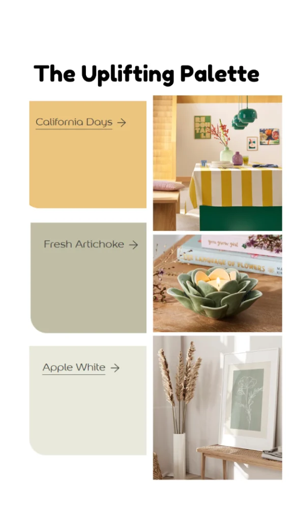
The uplifting colour scheme is perfect for adding brightness to your space. Featuring a soft yellow and muted greens, this colour scheme reminds us of spring, meadows and nature. We’ve chosen some decor options like bright tablecloths and cozy elements like candle holders and artwork to make your home feel close to nature but also cozy and calm.
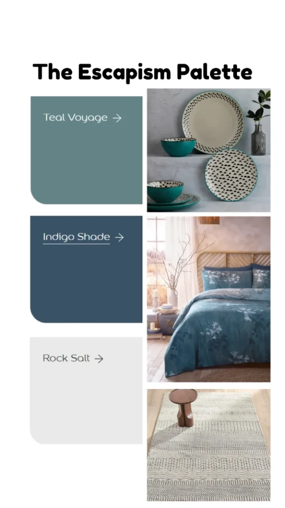
The escapism colour scheme is all about feeling close to the ocean and creating a serene space that is rich in colour while feeling rejuvenated. Play with pattern to bring out your adventurous side with textured elements around the home. This can be colourful dinner plates, floral bedding or rugs with geometric patterns to create visual interest in your space.
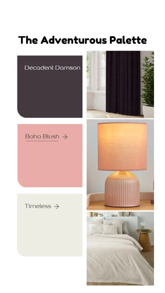
The adventurous colour scheme is all about going bold and taking inspiration from outer space. These three colours are perfect for adding layers to your space in a cohesive way. While the dark plum adds coziness, the blush pink is inspirational and experimental. Why not consider dark curtains in your space to bring in the warmth, then use pink decor to brighten your space through table lamps and textiles? Neutral touches like cream bedding and rugs can harmonise the space as well.
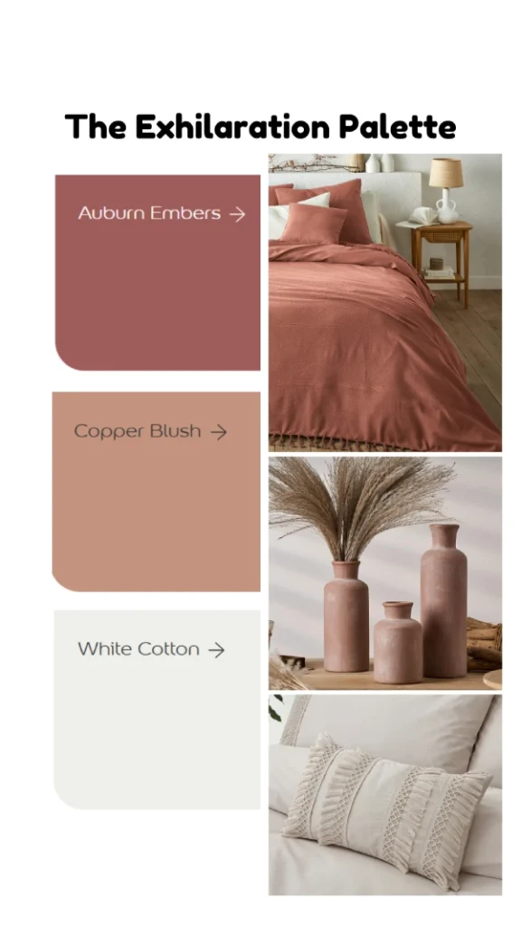
The exhilaration palette is designed to excite you, with dark reds and terracotta shades. This scheme is warm and fierce with boldness. If you love boho or Moroccan inspired interiors, this palette is for you. Think dark red bedding, terracotta textured vases and textures like tassel and crochet fabrics.
How will you Style Your Sanctuary?
Now you’ve discovered a range of joyful colours to use in your home, which will you try? Will you go for grounding, muted greens and sky blues? Or will you go bold with pink or yellow? If you’re still unsure, why not get a free consultation from us here.