The dining table is settled, the walls are painted and the chairs are in place. Then the new sideboard arrives and looks as if it came from another house. The wood is a shade too orange, or the white is brighter than the trim, and the whole wall feels slightly off.
Usually the piece itself isn’t the problem. Its color just wasn’t chosen with the rest of the room in mind. A coordinated dining room doesn’t need everything to match. It needs the colors to relate, either as a quiet echo or as a clear contrast.

Start with the Room You Already Have
Before looking at finishes, look at four things.
- The walls. Does the paint lean warm, with yellow, red or pink undertones, or cool, with blue, green or gray? White paint can go either way.
- The floor. It fills much of your view and sits right below the cabinet. Light oak, mid-tone hardwood, dark tile and a patterned rug each set a different starting point.

- The table. Look at the legs and base as well as the top. The base often sits at a similar height to the sideboard, so you’ll see the two side by side.
- The natural light. Check the room in the morning and the evening. A sample can look warmer, cooler, lighter or darker than it did in a store or on a screen.
Then decide what job the sideboard should do. If the room already has a focal point, such as a bold wall, a large painting or a statement light fixture, choose a color close to the walls or floor so it blends in. If the room feels flat, or that wall is the first thing you see when you walk in, more contrast can make it the anchor.
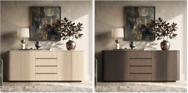
The same sideboard design in a natural wood finish (left) and a dark walnut finish (right), styled the same way against a warm plaster wall. Image: HOMSEE
Three Pairings to Try
These are starting points, not rules. Your light and furniture will change how each one looks, so test them in your own room.
Light Wood and Cream White
This pairing feels relaxed and airy. It suits casual everyday meals and smaller rooms, especially when the table also has a light top or base, so the two look related without being a set. Repeat the wood tone in a picture frame, a wooden bowl or the chair legs.

The common problem is too much softness. When the walls, floor, table and cabinet are all pale, the room loses definition. Add one darker element, like black hardware or a dark frame, so the eye has somewhere to land. Also compare undertones. If the cream and the wood are both strongly yellow, they can blur together.
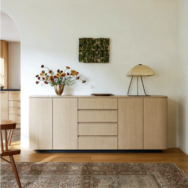
A light wood sideboard against a pale cream wall, with a vase of flowers, a pair of plates and a table lamp on top. Its dark base and a green wall piece add contrast. Image: HOMSEE
Dark Wood Grain and Soft Green
Dark wood against a muted sage or gray-green wall feels grounded and calm. It suits a cozier mood for evening dinners, and brass accents often sit well with it. Echo the dark wood in a mirror frame or the chairs, and the green in a plant, a vase or table linens.
In a room with little daylight, dark wood on a mid-tone green can feel heavy. A lighter green, a lamp on top or a mirror above can help. A very saturated green may also compete with the grain. Softer, grayer greens tend to let the wood show.
White Cabinet and Warm Gray
A white sideboard against warm gray walls, meaning gray with a beige or taupe undertone, looks clean and tailored. It suits dining areas that open onto a kitchen, because it can visually connect to white cabinets or trim nearby.
Either match its white closely to your trim or choose one that’s clearly different, since a near miss looks like a mistake. Bring white back in a lampshade, a few displayed plates or picture mats. Watch for a bright, cool white next to warm walls and creamy trim, which can look bluish or stark. Compare a finish sample against the trim in daylight.
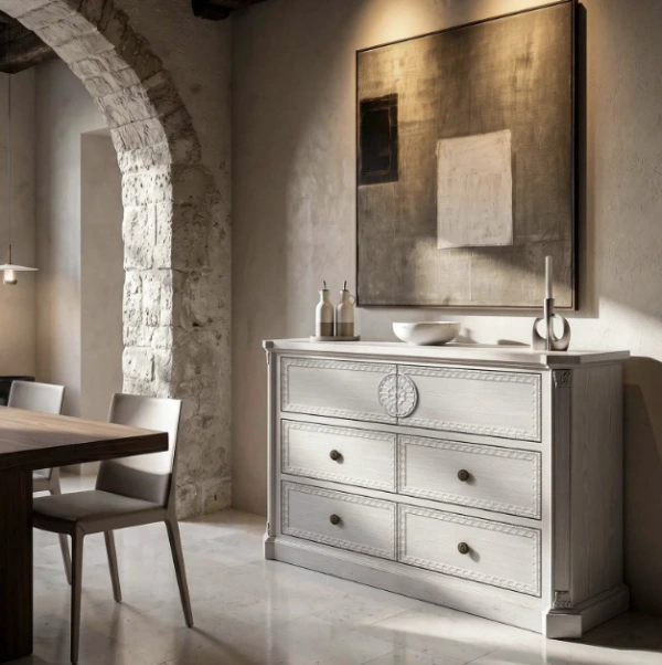
A white carved drawer chest beside a dining table, set against a warm gray plaster wall below a large abstract painting. Image: HOMSEE
Mixing Wood Tones Without a Matching Set
A table in one wood and a sideboard in another can look intentional. Three habits help.
Match the undertone, not the exact color. Wood finishes lean warm, toward red, orange or yellow, or cooler, toward gray or ash-brown. A honey-toned table and a reddish cabinet both run warm and can sit together comfortably. A gray-washed table beside an orange-toned cabinet is more likely to clash.
Make the contrast clear. Woods that are close but not the same can look like a failed match. A pale table with a clearly darker cabinet, or the reverse, looks like a choice.
Repeat one tone. Bring the darker wood back in a frame on the opposite wall, a lamp base or a bench. Repetition tells the eye both woods belong to the same scheme, and a rug that contains both tones can bridge them.
Styling the Top So It Still Works
The top is where the cabinet’s color connects to the rest of the room. A simple arrangement has four parts.
- A lamp at one end adds height and soft light for evening meals. A base or shade in one of the room’s colors helps tie things together.
- Art or a mirror above gives a backdrop. Hang it low enough to read as one grouping with the cabinet. A mirror reflects light in a darker room, while art can repeat the wall color or a wood tone.
- A tray keeps coasters, candles and keys from spreading.
- Two or three objects of different heights, such as a vase, a bowl and a few books, are enough.
A pale buffet with framed art above, a vase of flowering branches at one end, candlesticks, a small bowl on a stack of books and a stone sculpture. Image: HOMSEE
Leave the end closest to the table clear for serving dishes, a water pitcher or a stack of plates. If every inch is decorated, you’ll move things each time you set the table, and the arrangement won’t last. Keeping everyday plates, napkins and cutlery inside also means fewer things need to live on top.
Practical Checks Before You Decide
Before you commit, measure with your own furniture in place.
- Size. Measure the wall and note outlets, vents, radiators and window frames. A piece much longer than the table, or one that crowds a window, can look out of proportion.
- Doors and drawers. Check how far doors swing and drawers pull out, and that someone can stand in front of them while they’re open.
- Chair space. Pull out the chair nearest the wall as if sitting down. If that person can’t push back comfortably, you may need a shallower piece or to move the table.
- Walkways. Make sure the cabinet doesn’t narrow the path to the kitchen or a doorway when chairs are pulled out.
No single set of measurements suits every home, so test with your own chairs and the way your household moves. Painter’s tape on the floor marking the footprint makes this easy to see.
Once you know your color direction, size limits and storage needs, such as how many drawers you want for linens and cutlery or whether tall serving pieces need shelf space, you can start comparing options. HOMSEE’s sideboards and buffets is one place to compare finishes, door styles and storage layouts against that list. Keep your measurements handy and check each product page for dimensions and finish details.
If the new piece still looks a little out of place once it’s in the room, try adjusting the smaller things before changing the color. Swap the lampshade, change the art or add a table runner in one of the room’s tones.