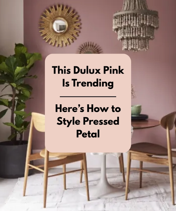
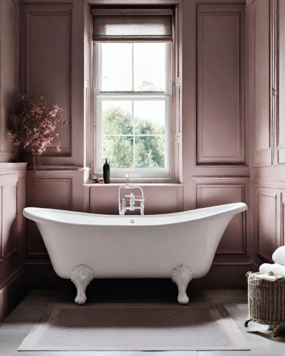
Let’s talk about using Dulux Pressed Petal in interiors! It’s like this gentle, blush colour that brings in a whole vibe of calmness and classy charm. Picture it—soft, serene walls or cozy throws in that shade just making your space feel all warm and chic. It’s not a loud and striking colour, it’s more like a subtle one which quietly steals the show with its effortless style. Mix it up with modern or vintage pieces, and vioala! You’ve got this versatile colour that plays nice with any vibe you’re going for. It’s like a soft, stylish hug for your room.
Think of a room where Dulux Pressed Petal takes centre stage—it’s like a timeless, graceful dance between subtle luxury and comfy vibes. It’s the kind of colour that turns your space into a chic sanctuary.
So, you’ve taken the plunge and painted your room in the serene and sophisticated shade of Dulux Pressed Petal. Now comes the fun part—dressing it up! This delicate, blush hue creates a canvas that invites various design styles, allowing you to infuse your personality and flair effortlessly. Here are some tips to amplify the beauty of a room adorned in Dulux Pressed Petal:
1. Incorporate organic elements to bring in a grounding effect
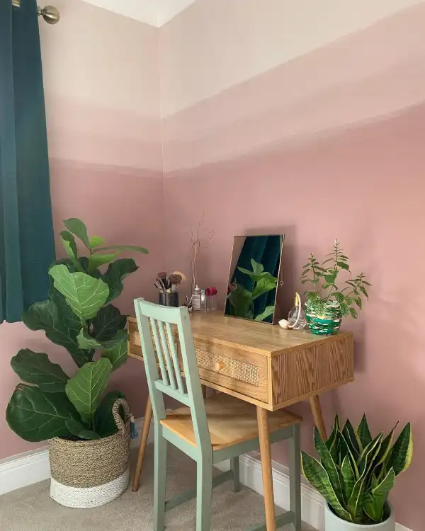
Image by @cherry_at_home on Instagram
Incorporating wooden furniture into a bedroom adorned with Dulux Pressed Petal colours effortlessly bridges the gap between nature and interior design. The warm, organic tones of wood create a natural harmony with the soft, delicate hues, fostering a serene atmosphere. Additionally, introducing natural fibre elements like rattan or jute further amplifies this connection to the outdoors, infusing the space with texture and earthy appeal. These elements not only complement the Dulux Pressed Petal palette but also evoke a sense of calm and balance, enhancing the overall ambience of the room.
2. Create neutral elegance by pairing Dulux Pressed Petal with other subtle and sophisticated hues
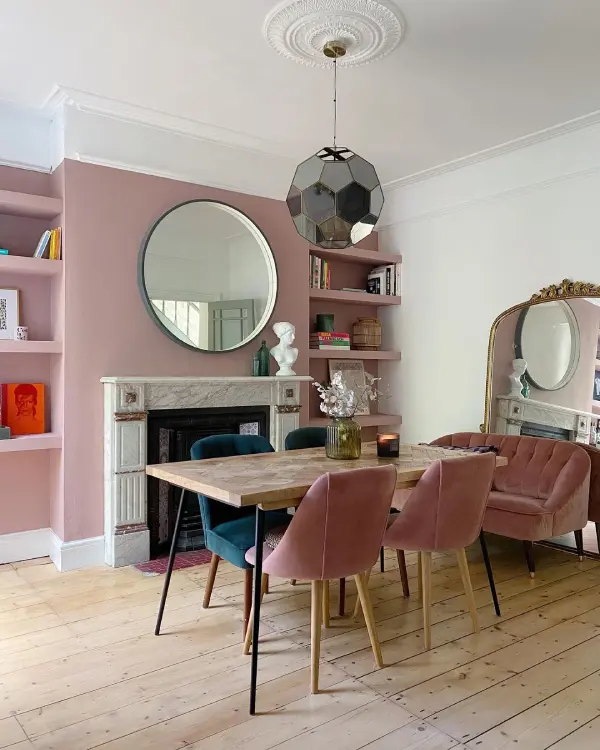
Image by @prettylittleterrace on Instagram
Dulux Pressed Petal plays beautifully with neutral tones. Consider pairing it with creamy whites, soft greys, or light beiges. This combination cultivates an atmosphere of tranquillity and sophistication, allowing the pressed petal to shine while maintaining a serene balance.
3. Create Artful Arrangements
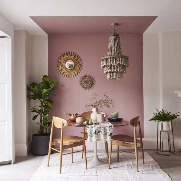
Image by Dulux
Adorn your walls with art or mirrors that accentuate the colour scheme. Consider artworks with muted tones or delicate designs that harmonize with the room’s palette. Mirrors strategically placed can also amplify the sense of space and light.
4. Play with contrasting colours
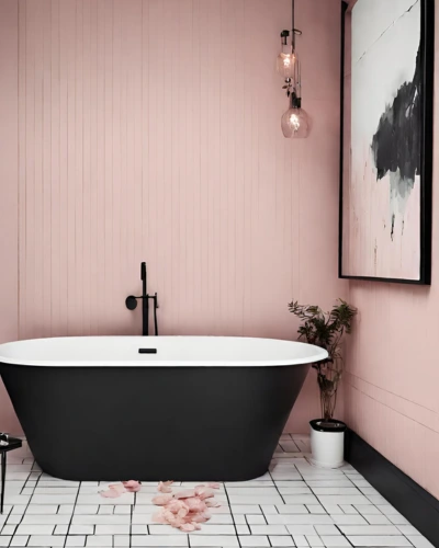
Picture a scene where a black tub or sleek decorative accents in this deep hue take centre stage against the softness of Dulux Pressed Petal walls. The contrast is striking—pressed petal serves as a gentle backdrop while the black elements exude sophistication and edge. The marriage of these two contrasting shades creates a luxurious ambience, transforming the bathroom into a sanctuary that balances elegance with a touch of daring flair. Whether it’s a matte black tub or chic accessories, this combination brings a contemporary, high-end feel to the space, making each moment in the bath a stylish indulgence.
5. You’ll never go wrong with soft lighting
Opt for soft, warm lighting that complements the gentle hue. Table lamps or pendant lights with fabric shades diffuse a cozy glow, creating an inviting ambience in the room.
6. Create visual interest through textural harmony
Introduce different textures to add depth and visual interest to the room. Think plush rugs, woven textiles, or tactile materials like linen and velvet in complementing tones. These textures create a tactile experience, enhancing the room’s cozy ambience.
7. Experiment with different hue combinations
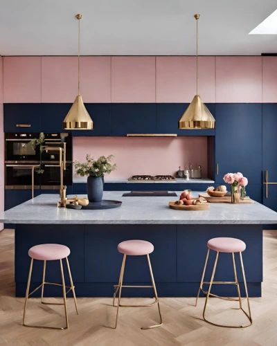
Add a splash of sophistication with navy blue. Think navy blue cabinets or maybe some chic bar stools in that deep, rich shade. The contrast against the Dulux Pressed Petal walls is like music to the eyes—it’s bold, yet it keeps that soft elegance intact. But wait, we’re not done! Let’s sprinkle in some gold accents—maybe sleek golden hardware or gilded light fixtures. These touches of gold add a dash of luxe to the mix, elevating the whole kitchen game.
8. Pair Dulux Pressed Petal with other subtle hues to create smooth visual transitions between spaces
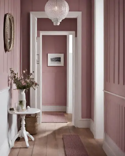
A hallway washed in the soft, delicate hue of Pressed Petal is like a gentle embrace as you walk through—serene, calming, and inviting living space. Now, pair that with crisp, clean white trim or maybe some pristine white doors. The visual effect? It’s like stepping into a cloud—it opens up the space, making it feel airy and light.
The combo of Dulux Pressed Petal and white is a visual symphony. The Pressed Petal sets this cozy, welcoming tone while the white elements bring this fresh, clean vibe. It’s like giving your hallway a makeover that whispers sophistication and warmth in every step. So, whether you’re coming or going, this hallway’s going to greet you with a sense of tranquillity that’s hard to resist!
9. Create visual drama by pairing Dulux Pressed Petal with darker shades of blue
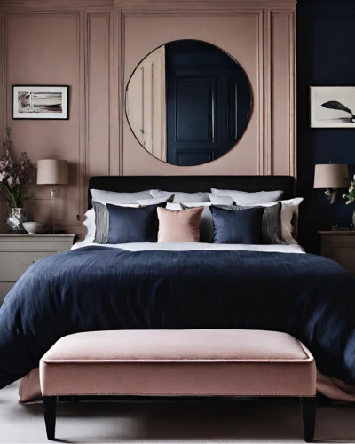
Oh, sweet dreams are made of this—Pressed Petal in the bedroom, paired with the deep allure of dark blue. Think of a sumptuous navy blue velvet headboard or maybe some rich indigo throw pillows. The contrast against the pressed petal backdrop? It’s like stardust against a velvet sky—mysterious, captivating, and utterly dreamy. Dulux Pressed Petal sets this calm, romantic mood while the dark blue adds this hint of drama and sophistication. It’s your personal retreat, an escape into a space that whispers both serenity and a touch of midnight magic.
10. Incorporate an interplay of colours and patterns
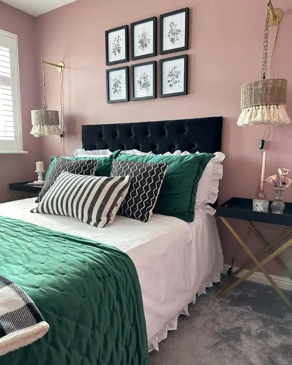
Image by @tracywhite_life on Instagram
Soft pinks or muted rosy tones that evoke a sense of tranquillity and warmth. Against this backdrop, the bed becomes the centrepiece, draped in lush, deep green or olive green sheets. The contrast between the tender petal tones and the rich, earthy greens creates a captivating visual balance.
An upholstered headboard in a deep green shade or a textured olive green fabric can add depth and sophistication to the room. To complement this elegant combination, consider pillows with subtle patterns incorporating both the pressed petal color and shades of green. Perhaps a mix of floral designs or geometric patterns that blend these tones harmoniously. This interplay of colours and patterns can lend a dynamic yet harmonious atmosphere to the space.
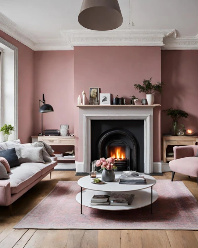
11. Warm up a white fireplace and shelving with Dulux Pressed Petal
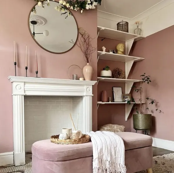
Image by @the_mortgage_mum on Instagram
In a living room adorned with a white fireplace and alcove shelving, the introduction of Pressed Petal brings a cozy and inviting aura. The subtle warmth of this hue wraps the room in a comforting embrace, making it an ideal choice for spaces where relaxation and tranquillity are paramount.
Paint Colours Similar to Dulux Pressed Petal
If you’re drawn to the serene charm of Dulux Pressed Petal, several paint colours offer a similar tranquil vibe while allowing you to explore various tones within the same family. These are:
- Dulux Blush Pink – a soft and subtle pink, echoes the gentle warmth of Pressed Petal, creating a serene backdrop for any space.

Shop Dulux Blush Pink
- Soft Peach – brings a slightly warmer undertone, offering a hint of peachy elegance reminiscent of a soft sunset.
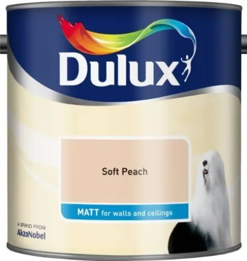
Shop Dulux Soft Peach
- Rosebud– with its graceful and muted rosy hue, embodies a sophisticated yet calming atmosphere akin to Pressed Petal.
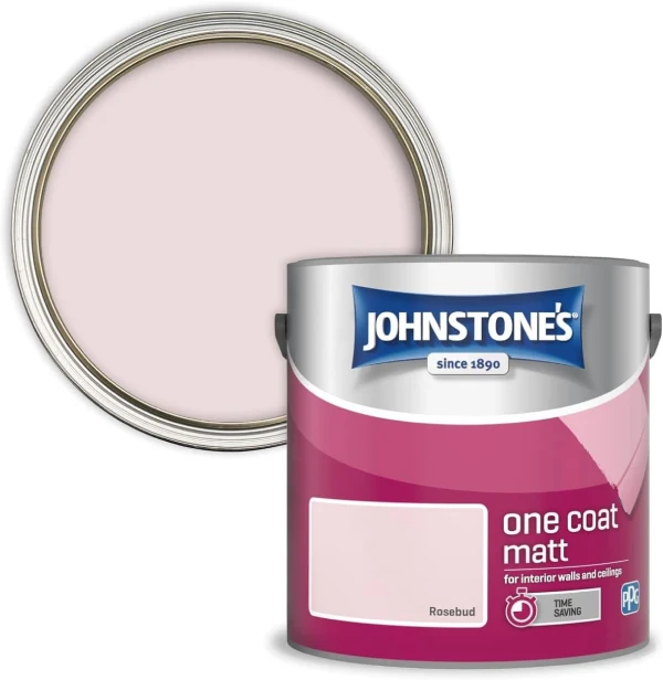
Shop Johnstone’s Rosebud Paint
These colours, akin to Dulux’s Pressed Petal, invite tranquillity and grace into your home with their soothing and versatile tones.
Colours to combine with Dulux Pressed Petal
Deep purple for a luxurious look
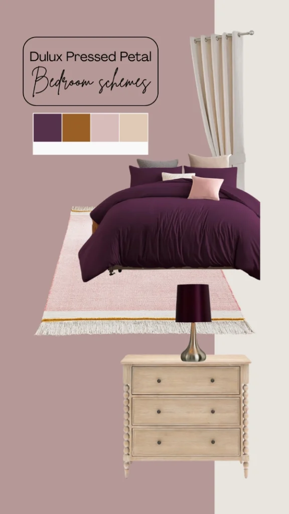
Keep the scheme light with cream and oak furniture whilst adding depth with deep purple for a glamorous finish.
- Rich purple duvet set
- Pink tassel rug
- Chest of drawers with bobbing detail
- Purple and gold table lamp
- Cream curtains
Light blue with grey accents
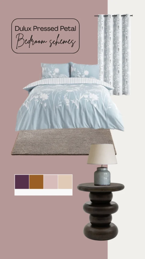
Combine blue and grey against Pressed Petal for a bright pastel room scheme, which keeps your room feeling joyful and summery. Include dark woods to add coziness into the space.
- Light blue floral duvet set
- Textured grey rug
- Round bedside table in dark wood
- Blue table lamp
- Grey floral curtains
Sage and olive green for a touch of nature
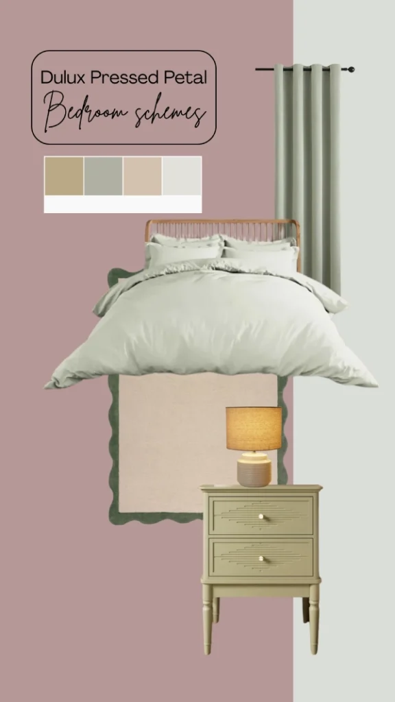
Infuse nature into a pink bedroom with sage green or olive. Sage green is good for keeping the scheme light, while olive green is perfect for adding warmth. Mix both greens together for the perfect combination.